From Concept Art to the Final Game
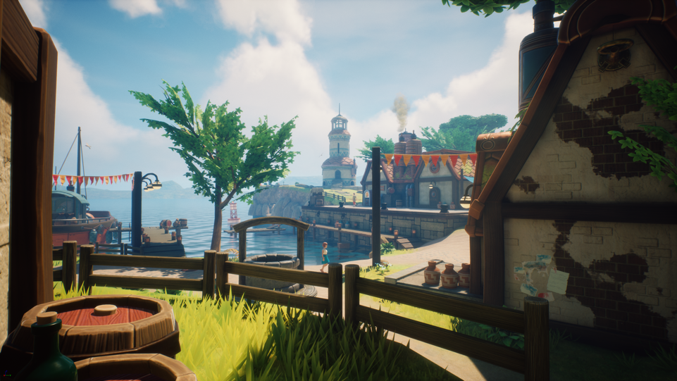
As it's customary in video game development, when we set out to find the right vibe for Oceanhorn 2: Knights of the Lost Realm, we came up with a bunch of concept art pieces. Fast-forward to now, with the game almost done. How much did we stick with those original ideas, and how much have we deviated from them? Let's take a moment and see how the locations we had in mind were implemented in the actual game.
"The most crucial difference between a 3D world and a 2D image is that on the flat image you can fake perspective quite significantly," says Miko, Cornfox & Bros. resident Game Artist.
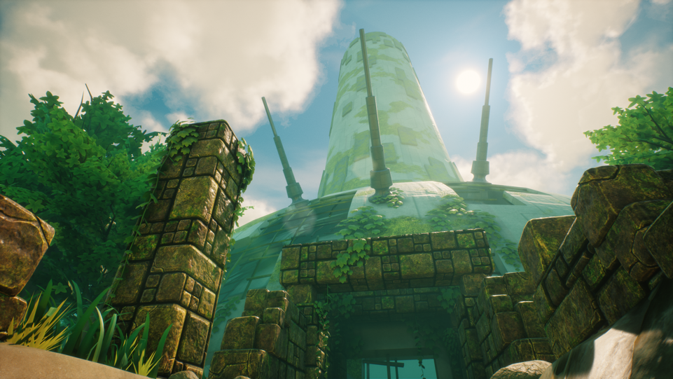
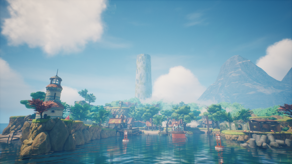
The Pirta Beacon
As an example, he offers the Pirta Beacon: "To have a perspective similar to what you see in the concept, you'd have to place our Hero straight under the beacon and look up."
The main goal we had wasn't 1:1 fidelity, but rather a reinterpretation of the original work that would fit a 3D environment. "When translating these locations from concept art to the game, we had to take the technical side into consideration, and we focused on the key elements making them recognizable."
See a tall mountain behind the beacon? "When you're playing, we need to make sure everything looks nice from every camera angle, and not just from the concept art point of view. Also, using the proportions straight from the concept art would make the mountain on the left really really tall."
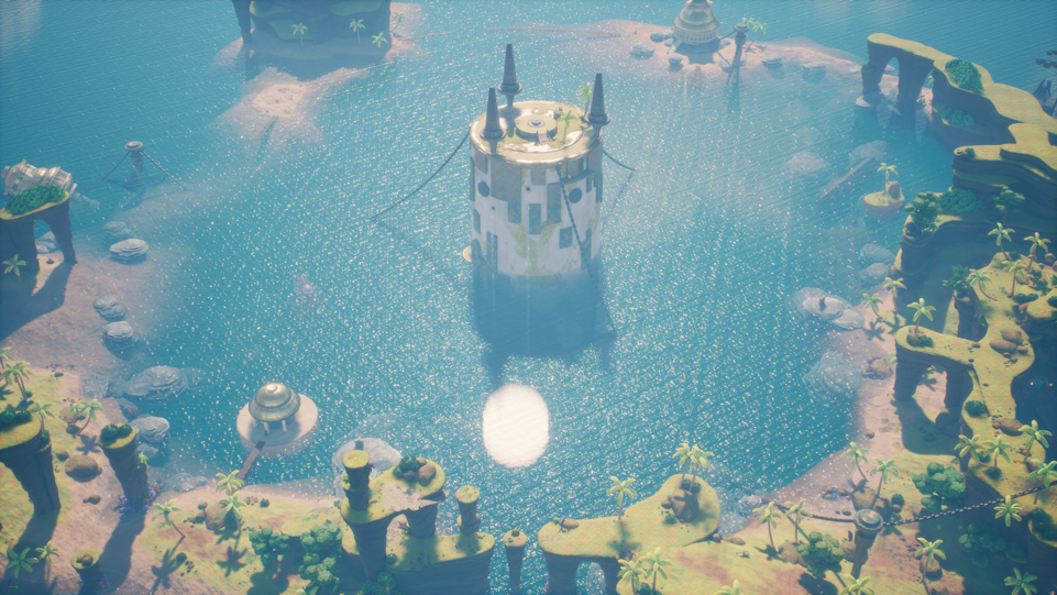
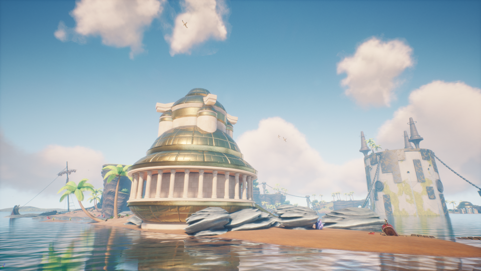
The Ootheca Beacon
With Ootheca, the main idea was to have one of these beacons submerged. Around it, there is a crescent-shaped island, and below it, a rift populated by algae. "We wanted to give the idea that there might be new game mechanics in this area, for example, underwater exploration," adds Miko.
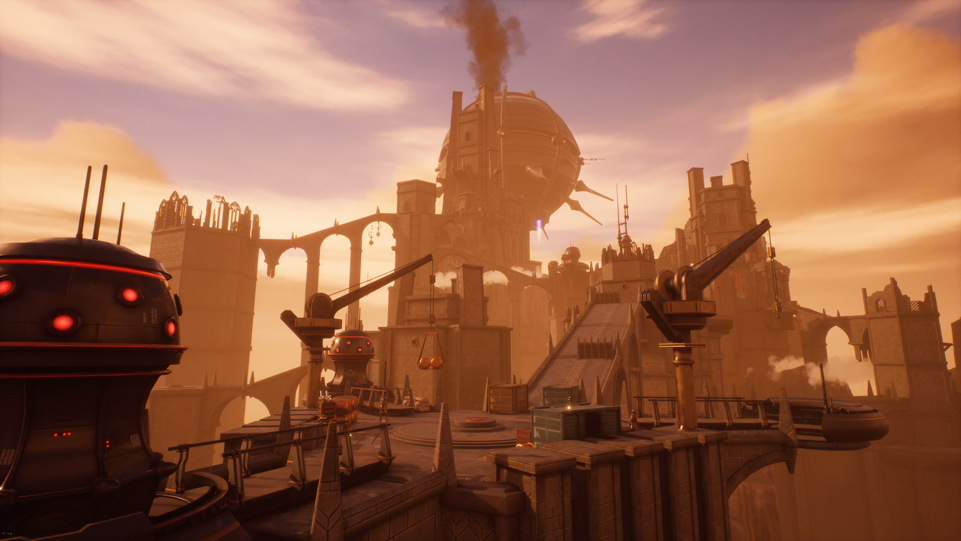
The White City Market
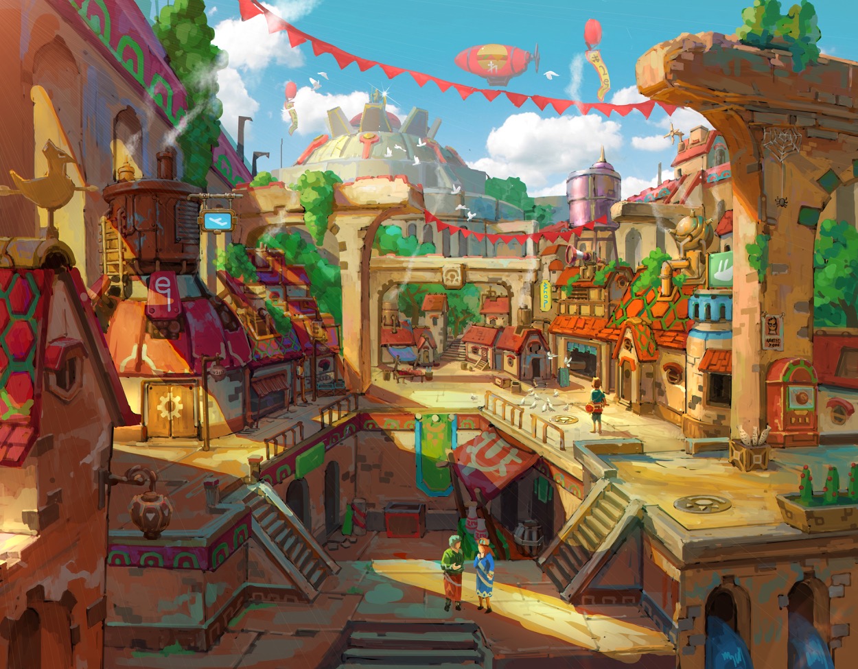
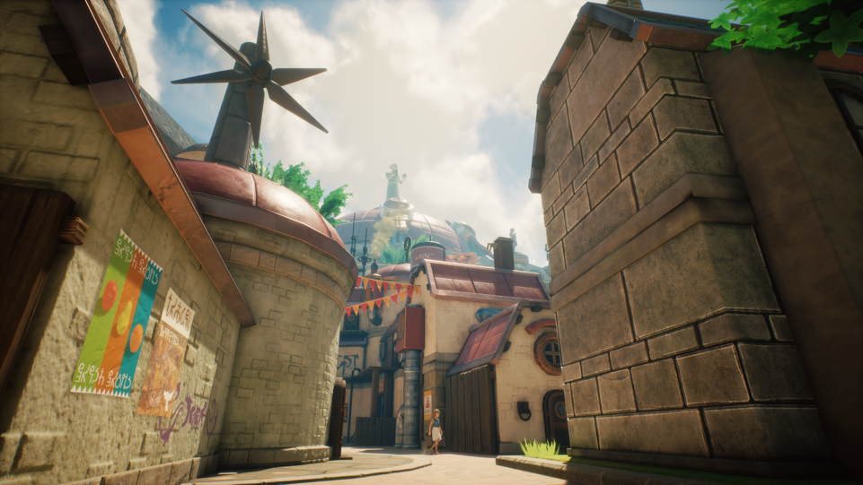
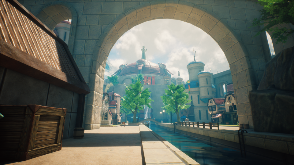
The White City Market is perhaps the location that evolved most from the original concept. In that piece, colors are very vibrant, but the feeling is a bit claustrophobic and there's more verticality. "As we proceeded with the development, we built cool swimming and diving mechanics. The game also features a nice water shader: so as we were planning the city, we wanted to show all these things, and allow the player to interact with water more often. That's why we have water canals now in the city" explains Miko. This is also an area the player keeps returning to, hence it needed to be approachable in different ways.
There are elements in the original concept that can’t be directly translated into the game. For example: while the sky appears very blue in the concept art above, the shadows and environment color indicate that the sun is shining from a very low angle, giving the environment a warm color temperature. The White City can be seen mostly in daylight in-game, so the city’s lighting looks quite different compared to the original concept art.
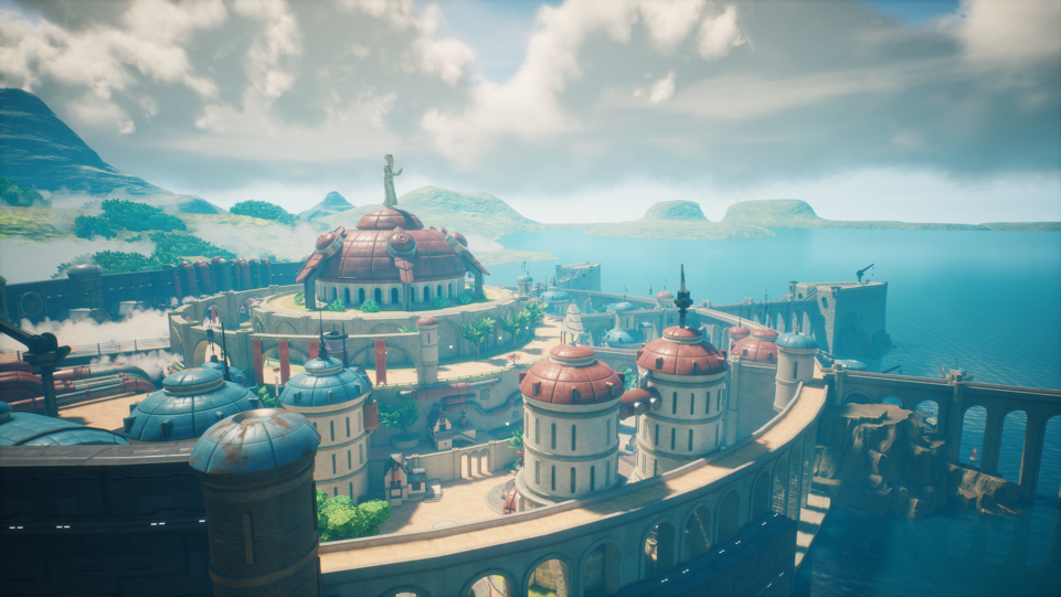
The White City
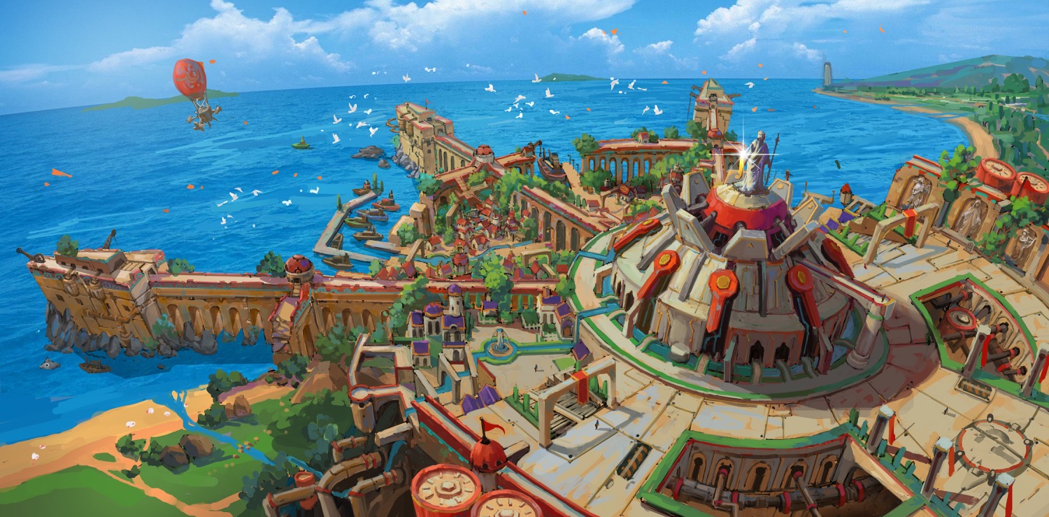
On the other hand, looking at the concept of the White City itself, you can see that the overall design has been maintained, and we've acted only on some minor architectural details. For instance, the buildings in the final game have a rounder design compared to the concept art.
"There's another thing worth mentioning", says Miko, "the scale in the concept art isn’t necessarily optimal right from the get go. One of the first things we did was setting up a simple level of the Capital that only featured its main geometry. Then we started walking around in the level to get a feeling of its scale: is it too big? Too small? How does the buildings fit? We altered a lot of things as we went along."
The Riskbone Citadel
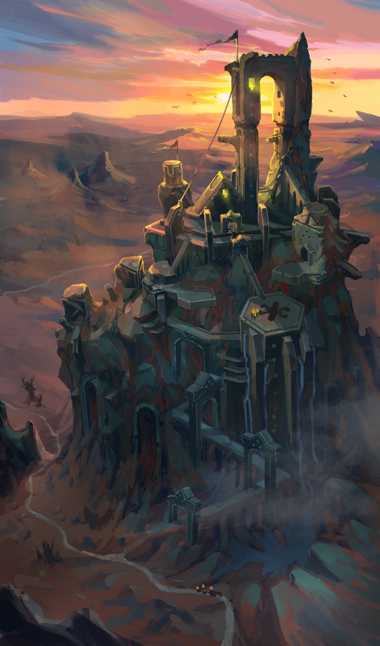
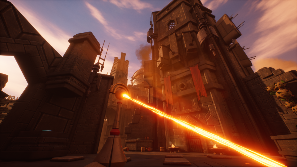
The Riskbone Citadel is an interesting case. "The concept art looks like a castle hosting a level, but we needed to have a bigger playable area outside, so it became much bigger than we forecasted originally." In the game, the highest tower is quite close to what can be seen in the concept art, but several other towers were added such as a prison tower and some watchtowers.
The building blocks for these areas mostly use a hexagon shape that can be seen in the original concept, and they share with it also a dark and gloomy feeling.
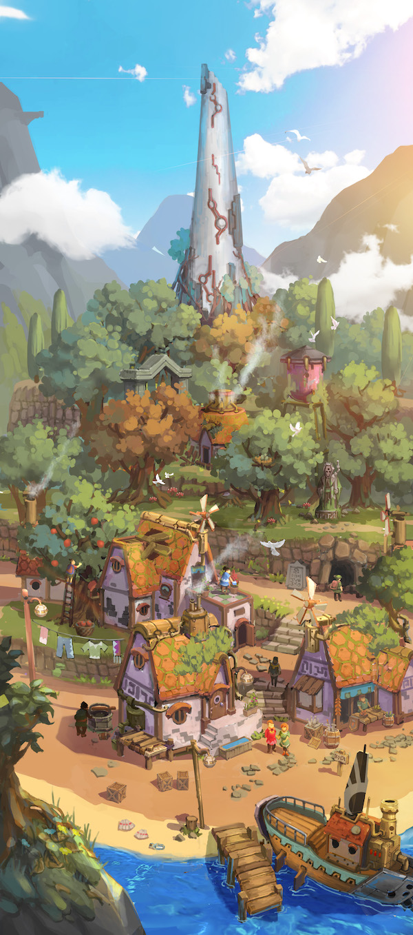
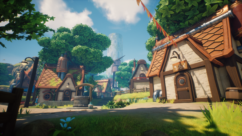
Arne Village
In the concept art of Arne Village, we can compare the quite orthographic view of the concept with the in-game perspective camera, which alters the sense of scale significantly. During the development of Oceanhorn 2, this area has seen a lot of changes and additions as the level has been a part of the game since the beginning. "The biggest difference here is probably all the additional fun things to do that we’ve added throughout the project," concludes Miko, "that's the best part, isn't it?"

